Curatorial Project — Photo Essay
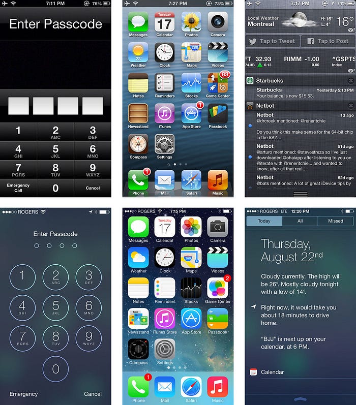
Comparing iOS versions from a skeuomorphic to flat design overview

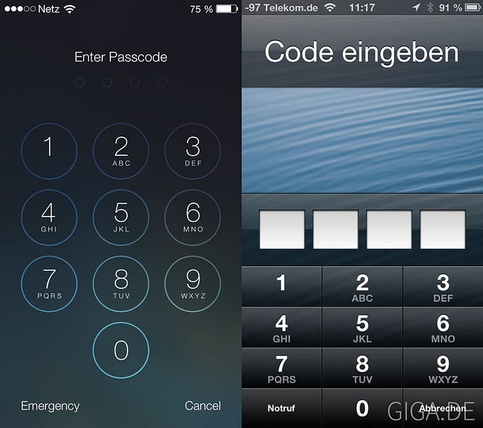
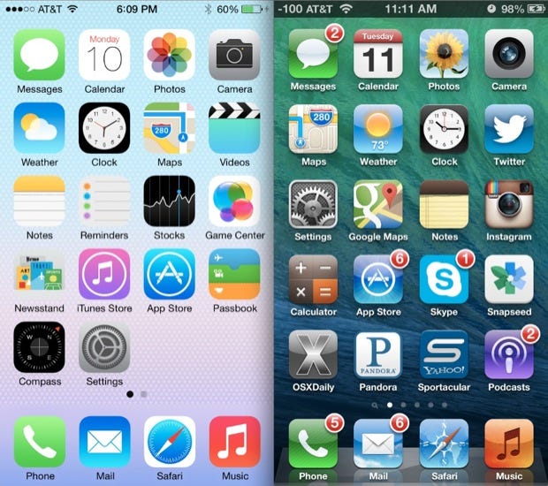
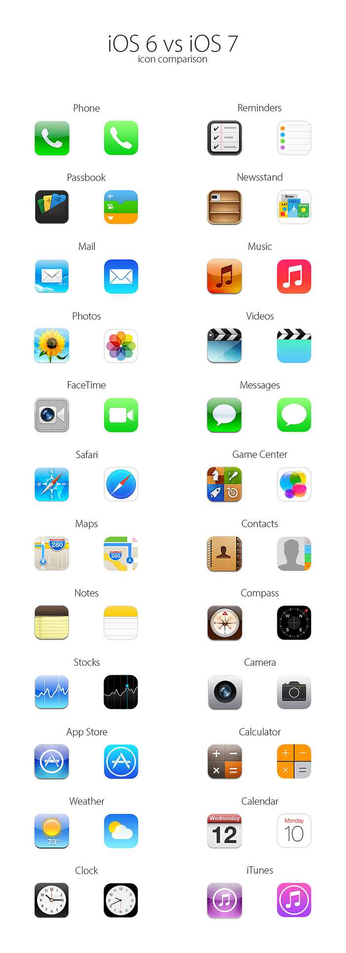
Next, let’s take an overview of some of the default iPhone apps that users use on an everyday basis. We can also compare and contrast the similarities and differences between each iPhone application.

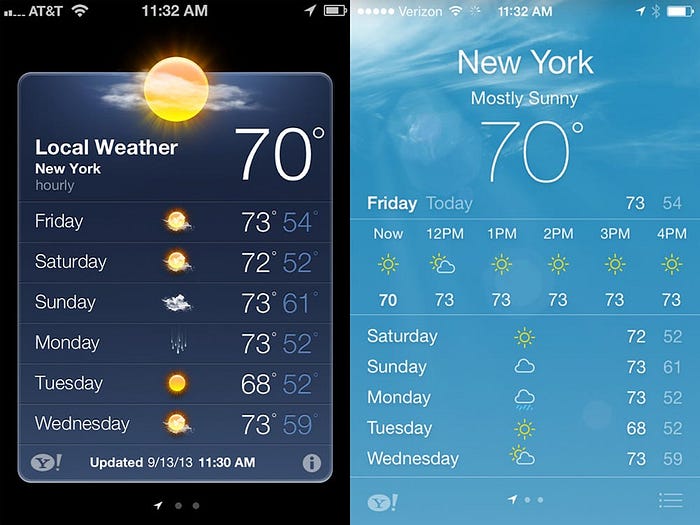
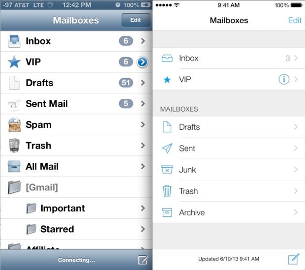

Summing up the connection!
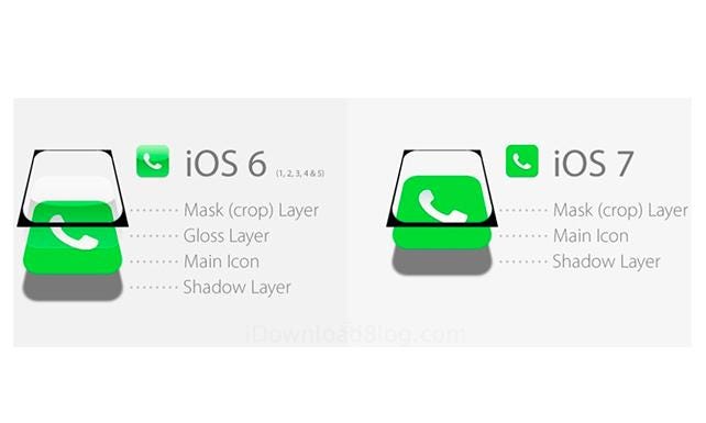
Overall, as you can see the images above, this is one example of how user interface designs have transitioned dramatically over the past several years. In this instance, Apple Inc. has made the move to completely redesign their overall user interface design outlook from a skeuomorphic look to a flat design look. This photo essay is a great example of visualizing the key differences as iOS 6 and prior was considered as the old and original look of the iOS system versus the new, modern, and minimalistic look of iOS 7. As the synthesis talks in depth about the different notions of how user interface design has gradually changed and influenced people’s approach to visual screens, this project was meant to show the continuous efforts of how interfaces and interactions can be improved to help create the ultimate user experience for people when utilizing technology. It is essential for people to keep up with the purposes of these design changes as they are the forefront of creating an experience on representing the information or data. Based on these screens, we choose how to interact and perform tasks if given the functionalities to do something. Design is a process itself; people are a process themselves. Whenever people find more innovative ways to create, update, or transition into, design will always follow through to make those ways become more apparent. Design is intelligence made visible to those who need to follow and be inspired. It is a story that people make and imagine to influence others.
Photo credits to Google Images.
